11 Famous Logos That Carry Deeper Symbolic Meanings Than We Know
On a brief note, if there’s something that 21st century is mad about, other than technology, then that is branding. Yes! despite the high prices of lack in availability people are nonetheless compromising regarding the brand they wear, they run or they use in their daily life.
Prominent on the screen brands like Durex, McDonalds’ and FedEx possess such designs that convey deeper symbolic messages we can ever expect of. Moreover, people don’t often strive to know what it meant but are for sure surprises us after being acknowledged. Now, what else do we know about the brands we wish to have? other than quality and price there are certain stories behind the name and logo.
Meanwhile, some stories carry a logical message, some are informative and some of them are quite simply the acronyms, check out the 10 behind-the-screen stories here:
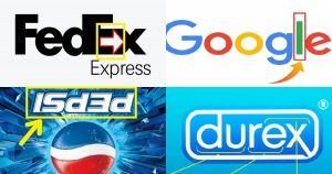
1. FedEx:
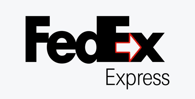
Many fail to notice the arrow formed by the empty space between the letters E and X. The arrow in the logo is what the designers were striving for, it depicts the customers’ subconscious, symbolizing the courier service’s speed and trustworthiness. Ain’t it quite good?
2. Gillette:
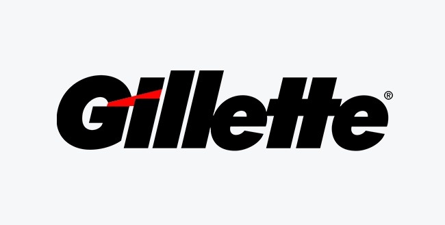
Unlike being the simple name, on a closer look, you can see that the edges of the letters G and I mimic the shape of the famous shaving machine’s blades.
3. Goodwill:
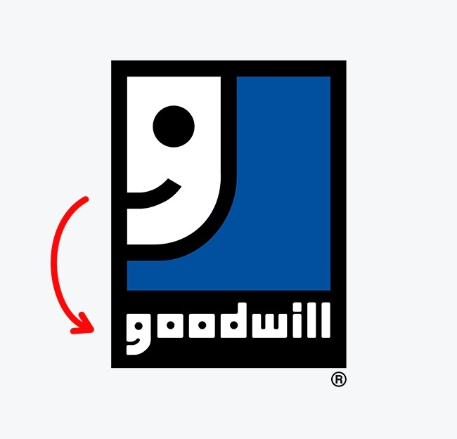
One of the world-renowned non-profit organization that collects donations of food, clothing, and essentials to help the needy. Employees of the organization believe that doing good deeds shouldn’t be regarded as something out of the ordinary but rather as an everyday activity.
The logo built around the letter G, from a distance, resembles a happy face.
4. Google:
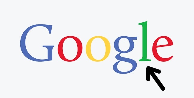
With red, yellow, and blue as the sequential colors in the logo, you may notice that their arrangement within the logo is subject to a specific algorithm. But the green-colored letter breaks with the overall logic, and it is clearly meant to be the most important letter in the word.
It is this unexpected splash of green, the designers seem to imply that Google is about breaking stereotypes and not playing by the usual rules, norms or whatever.
5. Chanel:
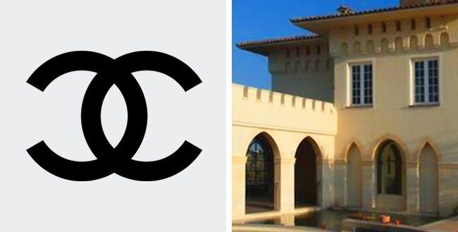
The story behind this logo has flavors of romantic and uniqueness. Coco Chanel drew it herself while staying at Château Crémat in Nice. According to one popular legend, the world-famous symbol was inspired by the castle’s vaulted arches. Many point out the magic of the letters since “CC” represents both the first letters in the name of the castle and Coco’s initials.
6. Durex:
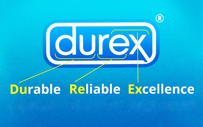
With the consecutive three parts of the company name carrying three meanings, Durex is one such brand that won the will and trust of many people.
Coming to the details, Durex is an abbreviation for “durable”, “reliable” and “excellence”, these are the most radical factors that decide everything.
7. Le Tour De France:
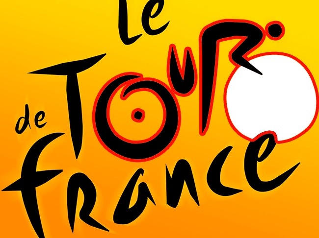
The prominent brand ‘Le Tour De France’ logo is just another one you cannot afford missing. Even if you’ve seen the logo of the famous Tour de France cycling race a million times before, chances are you haven’t once noticed an image of a cyclist hidden among the letters. If you take a closer look, the letter R forms the cyclist’s body, and the sun becomes the bike’s wheel altogether.
8. McDonald’s:
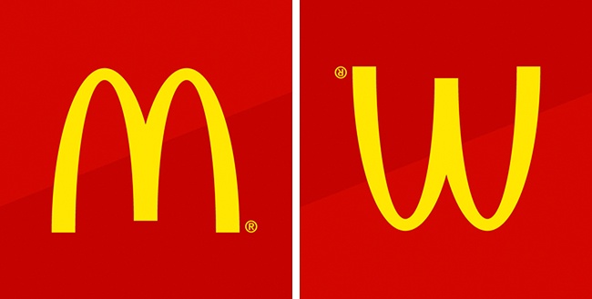
Red and Yellow being the primitive colors, the two arches are clearly visible. These architectural features quickly became the symbol of fast food. Later, the company wanted to abandon the logo, but psychologist Louis Cheskin persuaded the management to keep it.
Cheskin argued that this symbol looked similar to an upside-down image of the female breasts and therefore reminded people of their carefree childhood.
9. Mitsubishi:
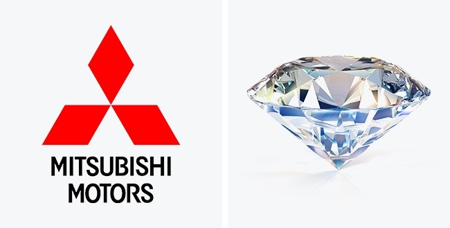
This consists the coat of arms of the Iwasaki family, the founders of the Mitsubishi company. The coat of arms features three diamonds stacked on top of one another. The diamonds represent reliability, integrity, and success, while the color red implies confidence.
On a brief note, Japanese believe that this color helps to attract customers.
10. Pepsi:
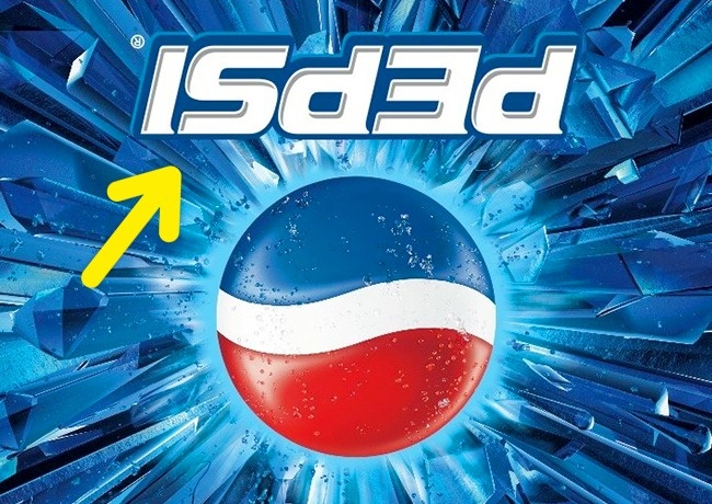
Back then in the run-up to the Mexican All Saints Day (aka the Day of the Dead), Pepsi once released bottles with an inverted logo. Most customers thought that it was a simple production defect, but some of the particularly savvy shoppers realized that, when inverted, the Pepsi logo read “isded,” which was very similar to the words “is dead”, when slightly parted.
11. Nike:
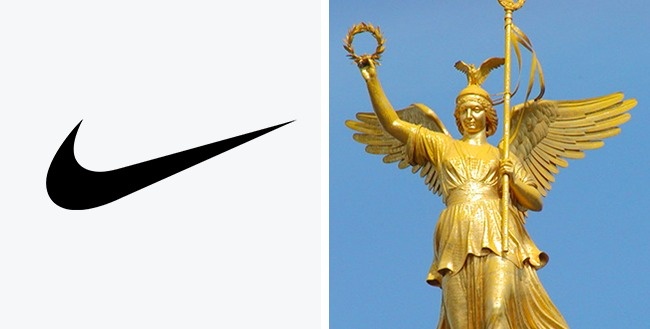
With the picture in the right, Greek mythology strikes-in. The famous symbol on the left represents the wings of the Greek goddess Nike who used to inspire warriors to victory.
Sources from the Pepsi revealed that student named Carolyn Davidson was paid a mere $35 for designing this logo in 1975, well, as per Pepsi’s humble beginnings, that is definitely a fair amount.