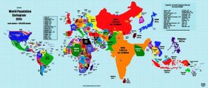
Someone Re-imagined The World Map According To Population and India Is A Massive Embarrassment
National borders of no nation are similar with the rest of the nations if we go through the world map. The borders might be making some nations dissimilar while few facts of their governance and aspects may have huge differences between them in international politics. Population growth in most of the Asian nations such as china and India has been a major concern which needs to be looked over. Tea Dranks of Redditor made an illusionary map which is redrawn according to country’s population size. He shared this map on 16th January 2015 calling it as ‘magnum opus’ – A great work of art or literature, which is indeed a magnum opus Tea Dranks. Redrawn map on the basis has been illustrated as below which is really gonna be embarrassing if you are from India. Have a look on it.

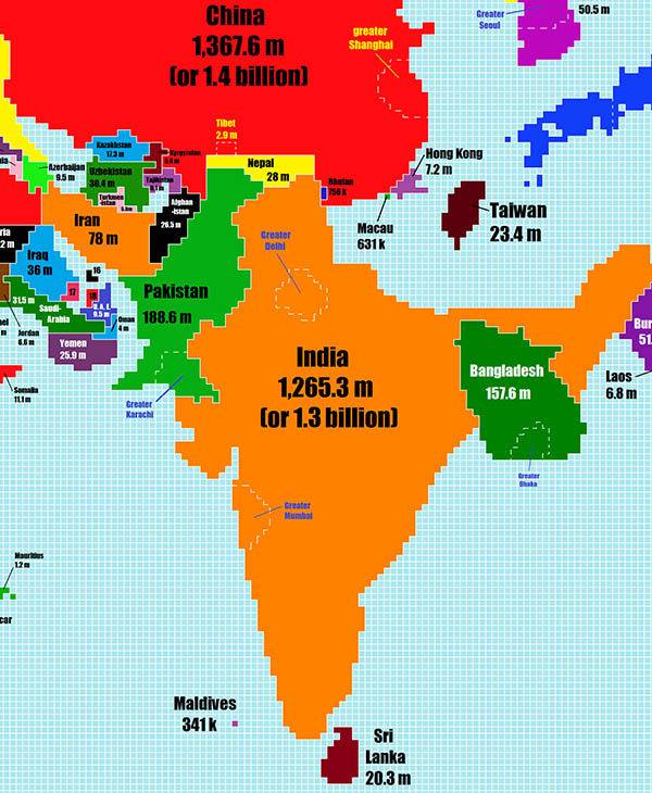
Child Production Reasons are High at its Pace in India, which looks as its major concern.
India acquires china’s place. Shakshi Maharaj does that make you happy and felicitous of increasing Hindu children’s population.
Above illustrated map might itself get puzzled to see that why Nepal is sharing boundaries with Pakistan which has minimal accuracy and improper etiquettes of mapping
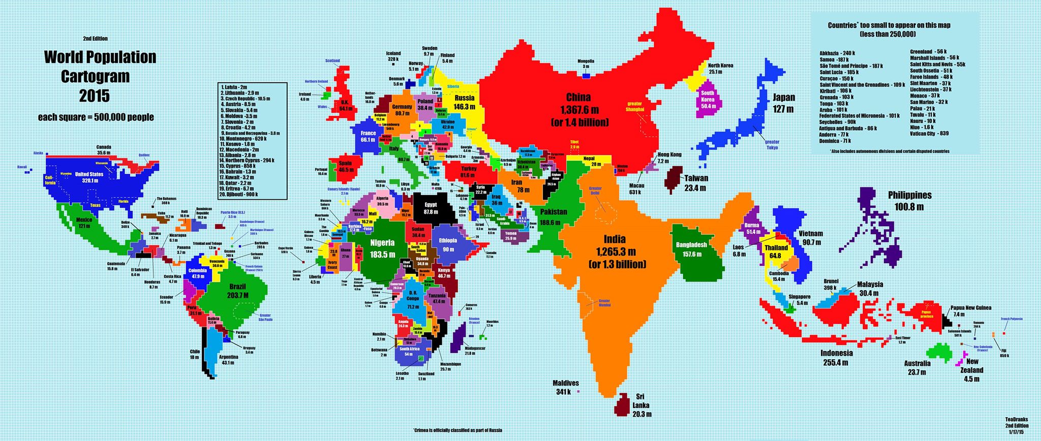
Amusing part of this map is that some big nations are so tiny in the redrawn map that they are blemish along the borders. Cross-check this with the Canada.
Population count has made the Big Country Greenland into a small nation.
Does the size of the nation matter at all, when it comes to population?