20 Before and After Logos of World Famous Companies Which You are Not Aware Of!
A company’s logo is a recognition tool for the public to link their services or products to the company. An effectively designed logo can bring to people’s mind the unique selling proposition of an organization, which inevitably promotes the company on a sub-conscious level. In other words, it is considered as the most critical element of company’s branding.
However, the logos of major companies that we have known today did not always look as they do now. Companies look to get their logos redesigned when the brand takes on a new approach or direction with its products or services. Check out how some of the famous brands have altered their logos since they originally opened their doors. Here, we have compiled a list of before-and-after logos for 20 of the biggest brands.
1. Canon:
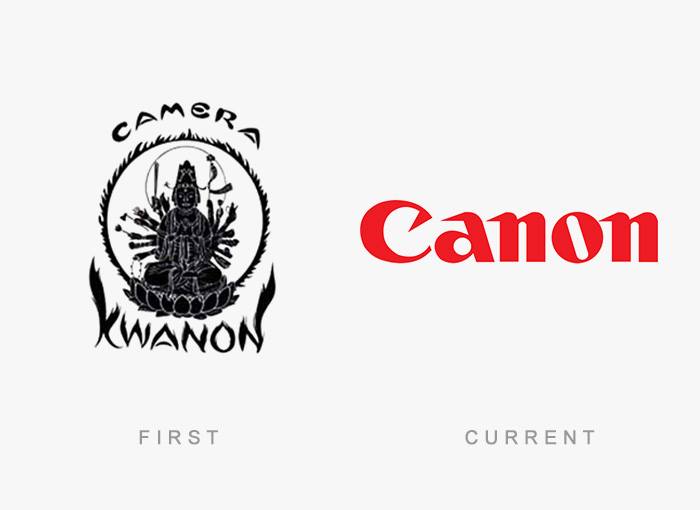
The Japanese camera company Canon’s first logo was indeed very different from what follows over the years. It was a depiction of the Buddhist’s Goddess of Mercy, ‘Kannon’ that was then simplified to a stylized text for the name of their first camera, Kwanon. After commercial success in 1935, the company changed the brand name to Canon and decided to create a more modern logo. In 1956, the logo was redesigned to the one we all see today.
2. Mozilla Firefox:
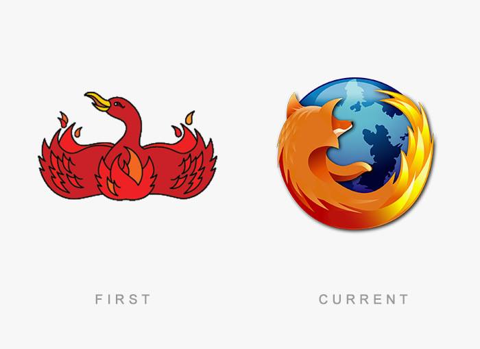
Originally a phoenix logo with wings outspread to match the program’s original name ‘Phoenix’ was designed in 2002. For legal reasons, the name was changed to Firefox in 2004 and the logo was redrawn as a fiery fox and globe. The current logo was designed in 2009.
3. Lay’s:
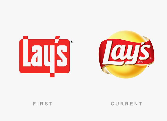
Lay’s first logo was designed in 1965. The brand then went three-dimensional with its current logo in 2007.
4. McDonald’s:
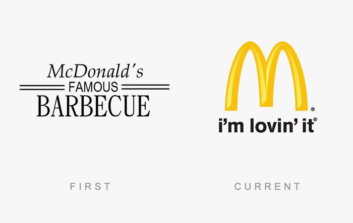
McDonald’s was originally known as McDonald’s Famous Barbecue (from 1940 – 1948). Since adopting the famous Golden Arches into its logo in 1960, McDonald’s has become the global leader in fast food. The company tried various versions of the iconic arches, coming up with today’s “I’m lovin’ it” in 2003. The current logo was designed in 2006.
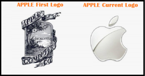
5. Apple:
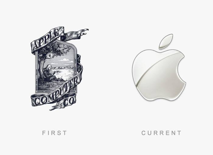
The first Apple logo was designed in 1976 by Ronald Wayne, where it depicts the famous scene of how Sir Issac Newton discovered gravity – sitting under an apple tree. The border around the image reads: “Newton … A Mind Forever Voyaging Through Strange Seas of Thought … Alone.” In the same year, the logo was replaced with one of a shape of an apple with rainbow stripes. The motive behind a bitten apple was so that people don’t confuse it with a cherry. It was then further simplified into a silhouetted apple image consisting of the only black. The sleek logo everyone recognizes today was introduced in 2003.
6. Adidas:
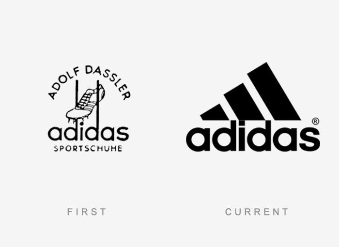
Many believe ‘ADIDAS’ stands for ‘All Day I Dream about Sports’. But this isn’t true. It’s actually taken from the name of the founder, Adolf Dassler. The first logo has three stripes on Adidas footwear and these stripes haven’t changed over the years; they’ve only changed in form. The current logo which was designed in 1997 has a three-stripped mountain on top of the word Adidas, to symbolize challenges to be faced and goals to be achieved. Hence, its motive is to inspire athletes to achieve great heights.
7. Starbucks:
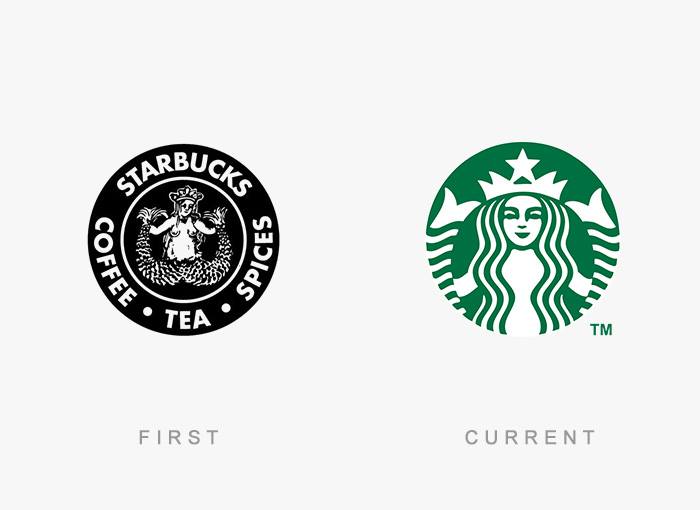
Starbucks was founded in Seattle in 1971. When it launched, it only sold roasted coffee beans and did not sell brewed coffee. Its logo was the Siren, a creature from Greek mythology that was said to lure sailors with its beautiful song and cause them to be shipwrecked. Later in 2011, the logo was slightly modified to give it a modern look.
8. Volkswagen:
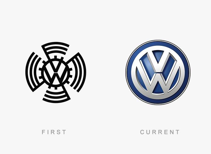
The original VW logo from 1939 features bumped teeth around the circle to make it look like a gear, with long arms rotating around the circle. However, the arms and gear bumps were eliminated shortly after WWII due to their similarity to the Swastika and association with the Nazi regime. And in 2000, VW colored the logo blue and silver. The core of the logo has remained the same with the V set atop the W.
9. Coca-Cola:
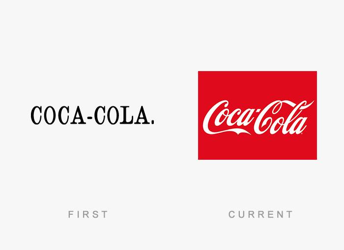
Coca-Cola’s first logo was not the script logo we see today but has a dull-looking black font spelling out its name. Later, Coca-Cola began to use its famous Spencerian script. Over the next century, there were many variations of its logos retaining its Spencerian script. In 1890, the company re-designed the logo to be more complex, featuring swirls and what appear to be cherries hanging from the “Cs” of “Coca-Cola”.
10. Ford:
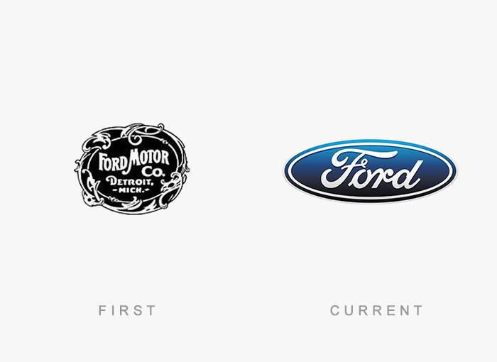
The original logo for the Ford Motor Co. was an embellished circle with the location and name of the company. In 1912, the Ford logo was given a complete makeover, as compared to the earlier simplistic design. It was changed to the famous blue oval in 1927 with the release of the Model A.
The company has experimented with different shape going from ellipse to circle, and even a diamond like shape in 1957. The 1976 logo was essentially the last major change in the symbol, and is very similar to their current logo. Finally, in 2003, the company released a new logo, which came to be known as “Centennial Blue Oval”.
11. Nokia:
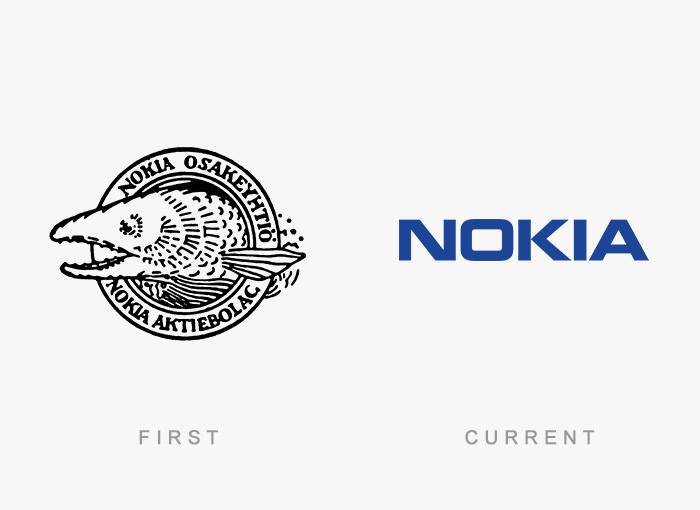
The first logo of Nokia was created in 1966 showing the image of a fish. This image should be inspired by the salmon fish of Nokianvirta River. In 1967, three companies, which were jointly owned by Nokia since 1922, officially merged and created Nokia Corporation. After the merger, Nokia Corporation adopted the logo which was all black rounded shape emblem, in which “Nokia” was written in white.
At the start of its telecommunication equipment manufacturing, Nokia adopted the logo which was quite similar to the current one, but with the light blue color and the arrow-like shape pointing upward, which represents the Nokia’s progress and advancement in the telecommunication industry.
12. Playboy:
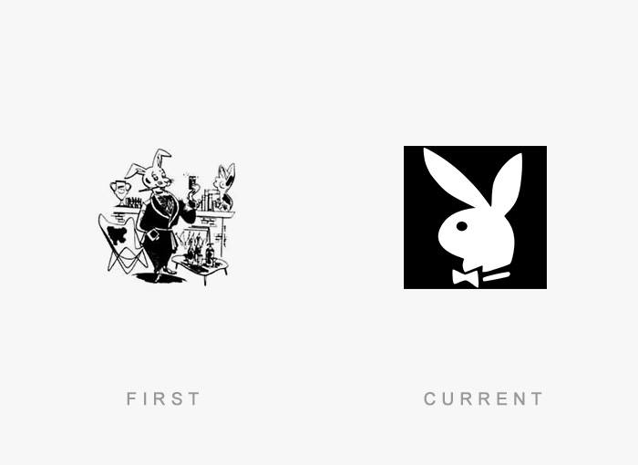
Art Paul created the now famous rabbit wearing a tuxedo bow tie as a ‘Playboy’ logo in 1953.
13. Nestle:
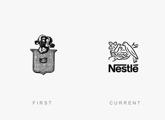
The Nestle logo was designed in 1868 by Henri Nestle, based on the meaning of his name in German. The logo also included a little nest and his family emblem. Later on, as the logo evolved, the mother bird’s beak was removed and the three fledglings were reduced to two to depict an average modern family.
14. FedEx:
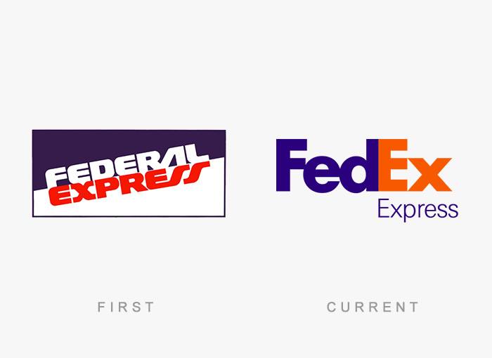
In 1971, the FedEx logo was the full name of the company, “Federal Express,” in blue and red at a slant, meant to be intentionally patriotic and associate the company with the U.S. government. In 1994, the current logo was designed, creating a shorter brand name.
The FedEx logo was considered one of the best logo designs for the clever use of negative space. If you look closely at the space between the E and the X, you will notice a small arrow hidden in between, meant to symbolize FedEx’s speed and accuracy.
15. Burger King:
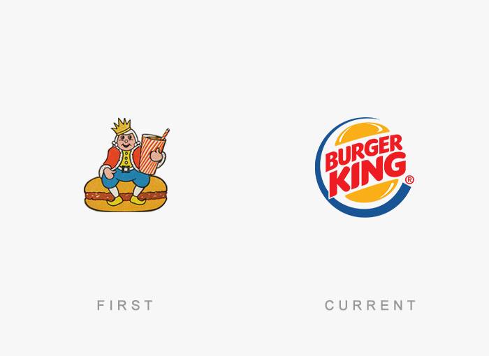
In 1953, Burger King was named as Insta-Burger-King and the logo incorporate with images of a king with a crown holding drinks sitting on a burger. In 1967, the logo was modified to a more dimensional and animated logo that sandwiches the name ‘Burger King’ between the two halves of a burger bun.
16. M TV:
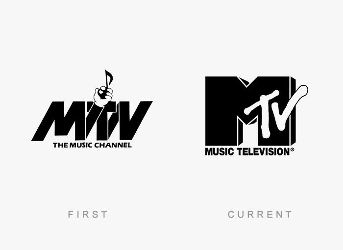
From the very beginning, the MTV logo has been constantly changing in color, patterns, and images that filled the block “M” on which “tv” is scrolled. During the 1990’s and 2000’s, MTV opted for a simpler white logo, while its general shape and proportions remaining unaltered. A 2009 rebranding overseen by Popkern reintroduced the idea of filling the “M” with various images, with the “tv” becoming a non-disruptive white.
17. Amazon:
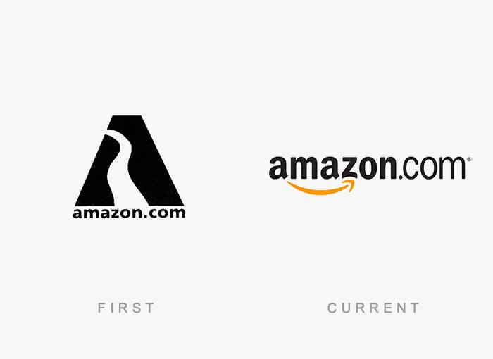
The name Amazon denotes the vastness of the online store directory. Also, there is an arrow in the word “Amazon” pointing from ‘A’ to ‘Z’, hinting that the store has the stock availability of items ranging from ‘A’ to ‘Z’! In other words, they are complete; they have everything.
18. Twitter:
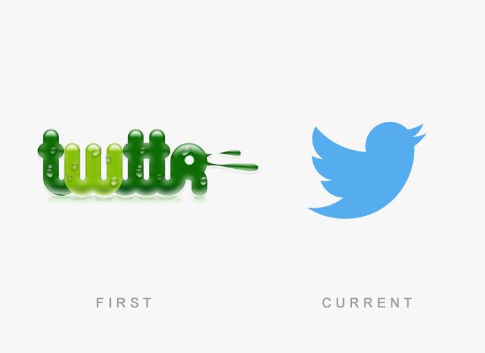
Back in 2005, the designers came up with the ‘green blob’ design that was said to ‘inspire youthfulness’. However, the name and branding were updated for the 2006 launch. September 2010 saw the debut of the now-famous Twitter bird. Twitter’s third logo redesign, released on June 5 2012, saw the introduction of the simply named ‘Twitter Bird’ icon.
19. Audi:
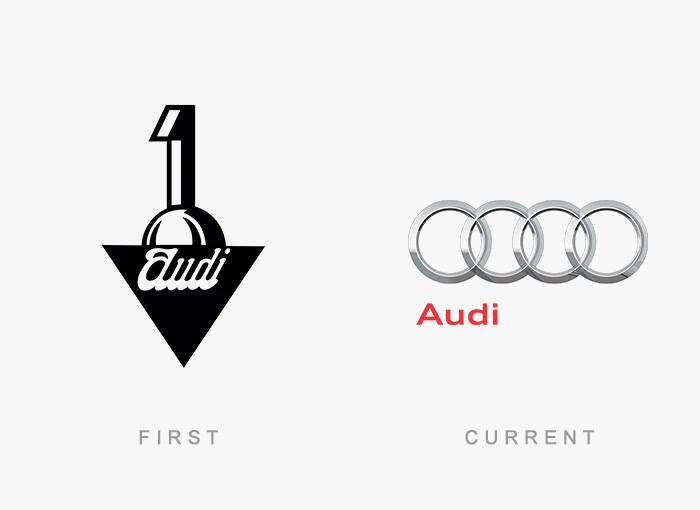
Audi’s logo has evolved from a flat design to one with depth. However, the iconic overlapping rings have remained part of the logo as they represent the company’s history: each ring represents the four companies of the Auto-Union consortium of 1932 – DKW, Horch, Wanderer, and Audi.
20. Instagram:
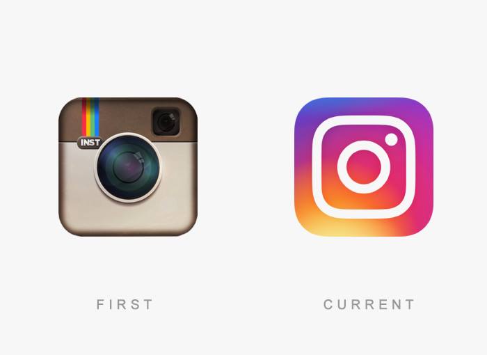
Instagram’s design team created a more “modern” app icon that still features the viewfinder and lens from the original logo.