World Chess’ New Logo Gets Labelled As Pawnography And Kama Su**a
It was only a matter of time before the internet found yet another logo to mock. The game of chess is more of a mental battle than a physical contest. However, going by the new logo of the World Chess Championship it seems like quite the opposite.

World Chess has come up with a new logo which we all may not necessarily like but one thing is sure that it has kept the whole Internet hooked to it. The new logo of World Chess is not something which we are used to seeing but showing a completely different or say a bold representation of the game of mind.
The unveiling of a logo for a big sporting contest is meant to be a grand occasion that builds up a flurry of excitement. Yet for the next World Chess Championship, the organizers may have gone a bit too far in trying to set pulses racing.

When their “trendy” new logo was revealed for next year’s flagship event in London it was met with a rather passionate response among grandmasters. The spirited 2018 World Chess Championship emblem by Moscow-based design firm Shuka.
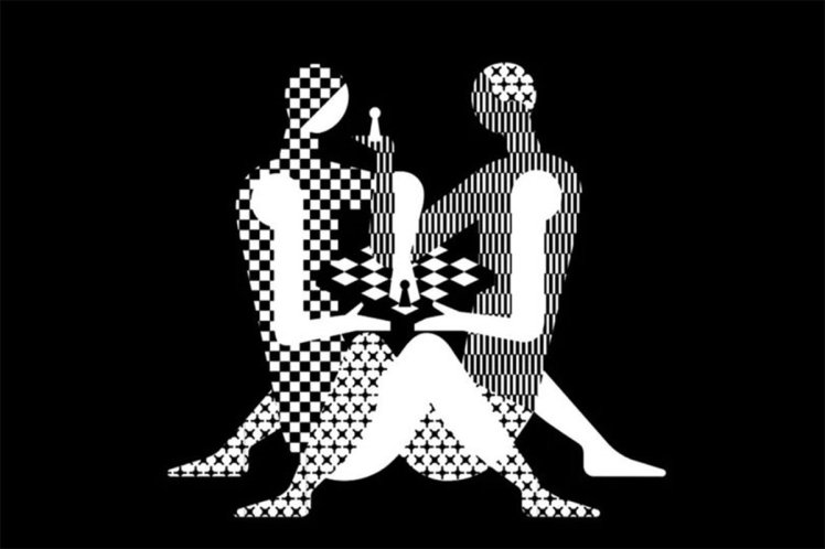
The image which depicts two chequered bodies interweaved around a chess board has not only left Grandmasters in a fix but also given fans cause for bewilderment.

Soon, it has been labeled as ‘borderline pawnographic’ and ‘Tantric Chess’ that may have come straight from Kamasutra. It is, World Chess say, unashamedly sexual. It’s been dubbed “#ChessIsSexy,” “Kardashian sexy chess”.
Watch The Video Here:
The British Grandmaster Nigel Short, a long-time critic of the game’s governing body Fide, said the organizers were “perhaps suggesting that they are giving the chess world a good f——.” And Grandmaster Susan Polgar, the pioneer of women’s chess, questioned whether the racy image was appropriate for children.
More than 50% of the world chess playing population are kids. They are also the biggest purchasing block by a HUGE margin, many times more than adults. Do you think that logo can be marketable in schools?
— Susan Polgar (@SusanPolgar) December 19, 2017
However, world chess states that the new logo is controversial and trendy, just like the host city, London. However, the Twitter users have different reactions to the new logo. A section of Twitterati is loving it and others are not.
Twitter Reactions:
This is the New Logo of World Chess Championship 2018. Not a great choice. @theworldchess @FIDE_chess – Consider scrapping this Logo. @logodesignteam Will be happy to help you with a much better, professional and apt logo for such an esteemed championship. #Logo #Fail #WorldChess pic.twitter.com/S0xXu9lZ8r
— Srish Agrawal 🌐 (@srishagrawal) December 21, 2017
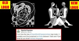
From how the new #ChessWorldChampionships logo looks, it probably won’t be broadcast in #India between 10am and 11pm. What do you think? #chess #logogate pic.twitter.com/jlTcR9reGE
— Sports Express (@Xpress_Sports) December 21, 2017
My husband told me to get inspired for a new fic by the chess world championship logo. pic.twitter.com/8ROgBHqeXj
— Maria 마리아 (@Smut_Hemingway) December 21, 2017
Man this new chess logo is sexy. https://t.co/b5XENoyGwS
— Jonargles Bells (@ArglesJonathan) December 21, 2017
Hardcore pawn : New logo for the world chess championship. pic.twitter.com/Sx6YTEDNux
— Vishal (@Lavish) December 21, 2017
RT chesscom “RT Sam_Copeland: Mothers around the world react to theworldchess’ new logo. 🙈 pic.twitter.com/XlHsB7yyf1” https://t.co/7nNrnifbBJ
— Chess Club Live (@ChessClubLive) December 21, 2017
The new World Chess Championship logo is great. I know when I’m practicing the tantric kama sutra what I always feel is missing is a nice game of chess. pic.twitter.com/eCd6kNjWHJ
— AJ Sacher 🐧 (@AJSacher) December 21, 2017
Judging by the new 2018 World Chess Championship logo we can look forward to some hot nerd on nerd action. pic.twitter.com/ppEI68oCov
— Rob Vining (@Robertevii) December 21, 2017
Shuka’s art director and founder Ivan Vasin say he’s pleased that the emblem is helping draw a spotlight to the notoriously nerdy sport. “We are happy that there is the reaction,” Vasin tells Quartz. He explains that the design is meant to champion humans in a sport that’s increasingly tethered to bots and computers.